Transitioning users from the old overwhelming software to a task-focused minimal interface in multiple phases.
Overview
- Role
- Lead UX & Visual Designer
- Project Co-ordinator
- QA & FrontEnd development
- Scope
- UX
- Visual Design
- Prototyping
- Coding
- Testing
- Timeline
- 5 months; part-time work
- 2018 - 2019
- Company
- Last Door Solutions
- 2 Designers / 3 Engineers / 1 PM
About the project
TraQ-IT is a leading developer & provider of software solutions for trade-show organizers. This case study talks about the journey of evolving their event management software.
My Role
I conducted the comprehensive evaluation of existing functionalities, resolving critical usability issues, & redesigning the user experience for a 20+ year legacy product, introducing innovative solutions to modernize and elevate its design.
I worked alongside a design manager, 3 stakeholders, 4 Engineers, and a Product Manager to bring this project to life.
Key Impact
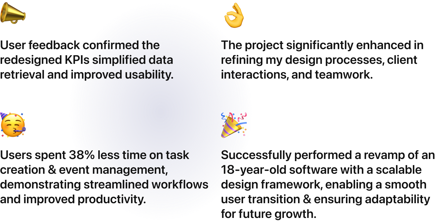
Users spent 38% less time on task creation & event management, demonstrating streamlined workflows and improved productivity.
Successfully performed a smooth revamped an 18-year-old software with a scalable design framework, enabling a smooth user transition and ensuring adaptability for future growth.
Problems
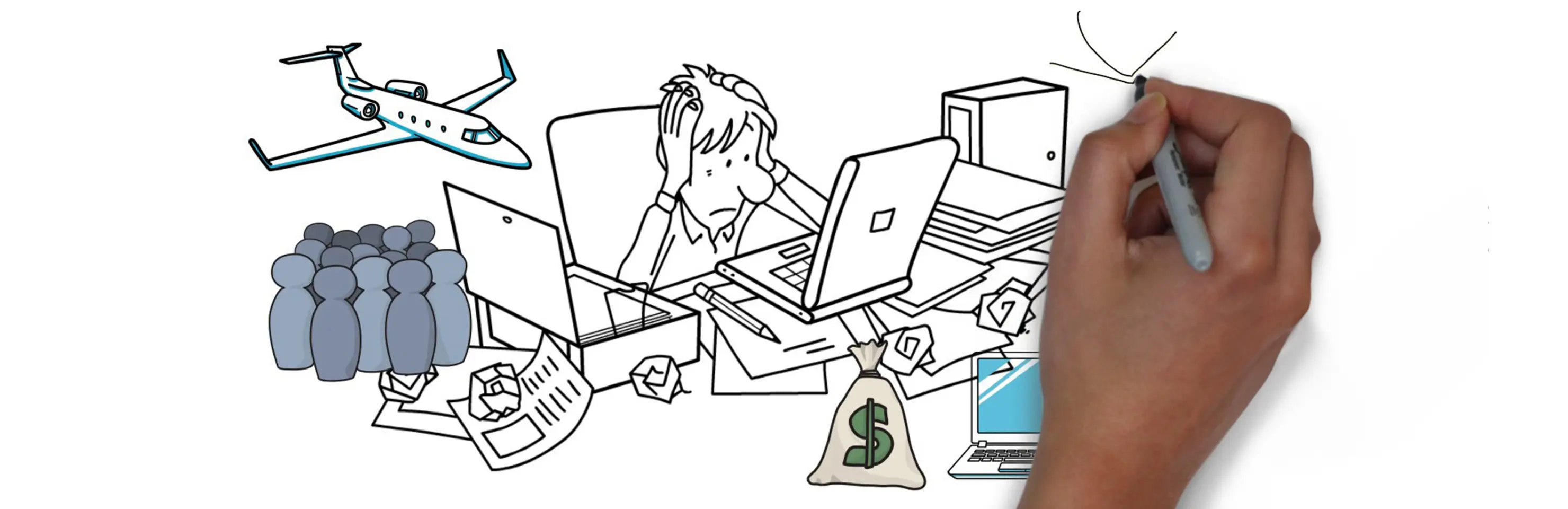
Users spent excessive time (around 1.5 hours daily) on data input, with 55% abandonment during this phase.
Users are finding themselves bogged down with the current software, spending a ton of time every day just entering data—a tedious process that’s causing over half of them to abandon it altogether.
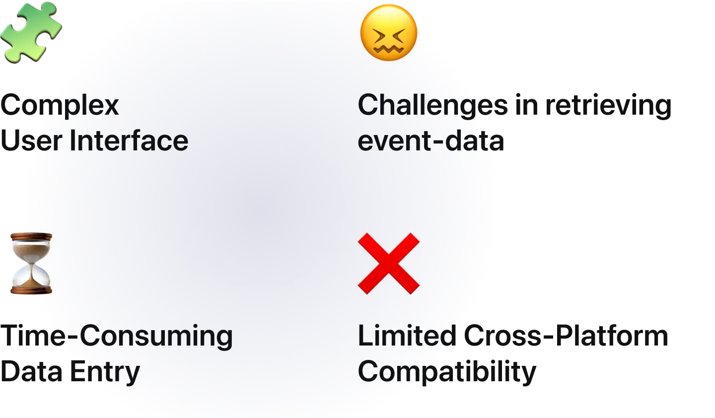
The interface feels cluttered and confusing, making it difficult to navigate or quickly retrieve important event information.
Adding to their frustration, the software doesn’t work seamlessly across different devices, so users are often stuck using it on one platform. To make matters worse, it's outdated and buggy, turning routine tasks into frustrating hurdles.
The entire experience feels outdated and inefficient, leaving users looking for a smoother, more intuitive solution that actually meets their needs.
Approach:Research, Close-Collaboration & Execution
Prioritizing user transition over outright software redesign.
I strategically led the project by breaking it into well-defined phases, ensuring a seamless transition for users from the familiar to the innovative. My approach focused on balancing modern design principles with user familiarity, effectively managing stakeholder feedback, and navigating challenges like tight budgets and prolonged development timelines. The case study showcases how these efforts improved user efficiency and satisfaction, underscoring the critical role of user-centered design in driving software evolution.
Solution
Redesigned the entire app to deliver event insights, streamline tasks, and minimize cognitive load, resulting in a significant reduction in time spent on key activities. The process began with an immediate UX audit to identify pain points and implement critical bug fixes, ensuring smoother app performance and a more stable user experience. Building on this foundation, the design was reimagined to redefine event management, shifting the focus toward task-based and insight-oriented workflows. This approach not only improved usability but also empowered users to make informed decisions efficiently, turning the app into a powerful tool for productivity and clarity.

<span>Solution<br />Highlights ↓</span>
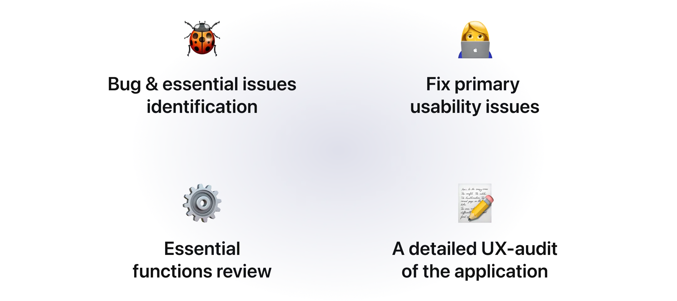
Took an immediate action to get the application up and running
I took an essential first step toward enhancing the current state of the product. This stage involved a deep dive into the software, where my focus was sharply on identifying and addressing several key areas that demanded immediate attention for improvement, fixed broken flows, automated data fill-ups wherever needed, fixed primary usability issues, performed a UX-audit, and then prepared a detailed UX-Audit of the application to move towards to the next phase which worked as a bridge for old to a new application.
Built a
transitional software
I needed to strategize the transition of the users from using the old crappy application to a simple, task-focused one.
In my journey to modernize our application, I created a version with an updated UI, refined interaction changes, and minimal, improved alterations in the user and information flows. My intention was clear: to facilitate the seamless execution of daily tasks by our users, leveraging the sleekness of modern UIs and functionalities while stripping away the unnecessary clutter that had become synonymous with the older app.
In modernizing the app, I prioritized a balance between usability and the familiarity valued by our users. The redesign subtly integrated modern aesthetics with the original interface's layout to avoid alienating long-standing users. Efforts focused on enhancing usability and efficiency, with minor interaction adjustments for an intuitive user experience. Through collaborative development and user feedback, we crafted an MVP that respects our app's legacy while meeting contemporary expectations. This approach honored user loyalty while elevating their interaction with the app, ensuring a seamless transition to the modernized version.
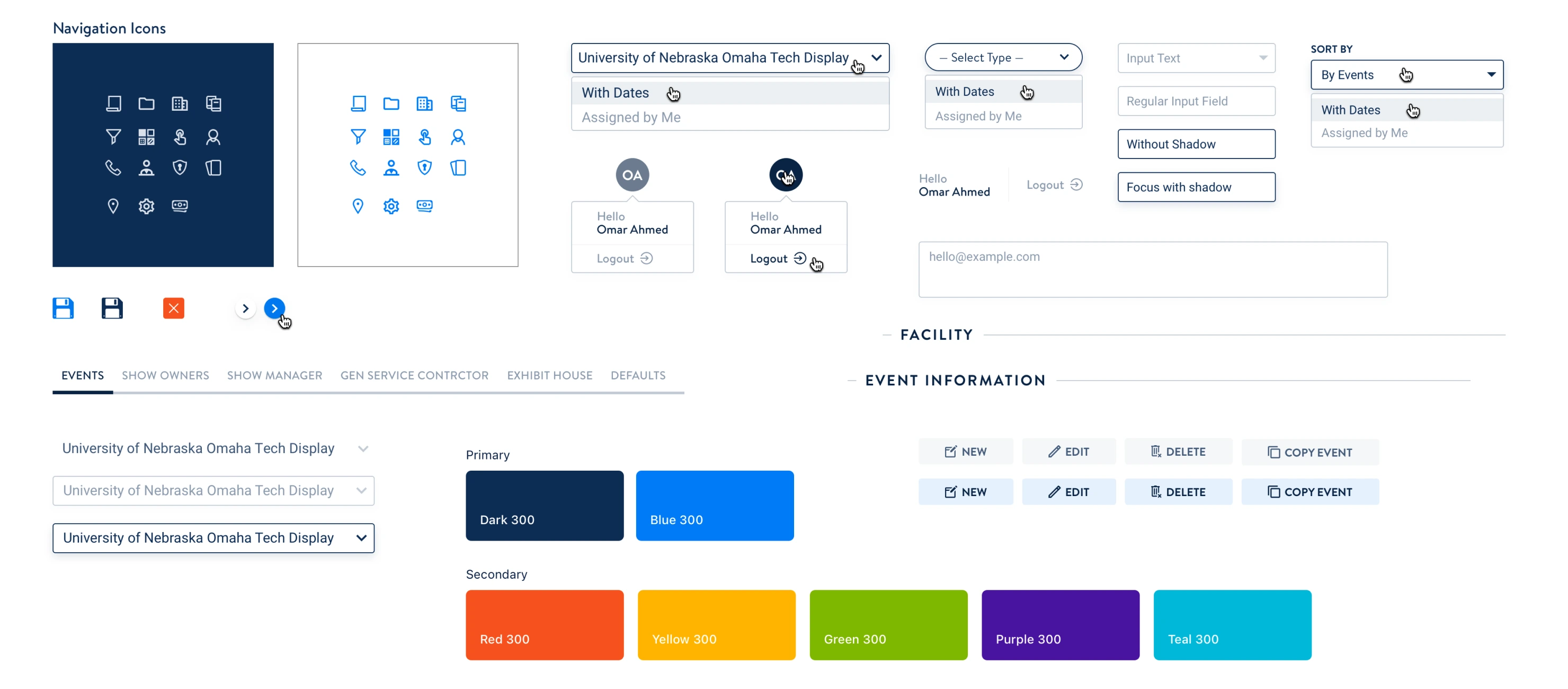
Collaborating closely with the development team, we crafted an MVP featuring a revamped UI. This new interface was infused with modern components yet retained a semblance of the previous design. This strategic choice was driven by a deep consideration for our current user base, notably those of advanced age, to ensure they found the new interface reassuringly familiar, akin to the comfort of an old friend, yet refreshed with the vitality of the unknown.
The Redesign
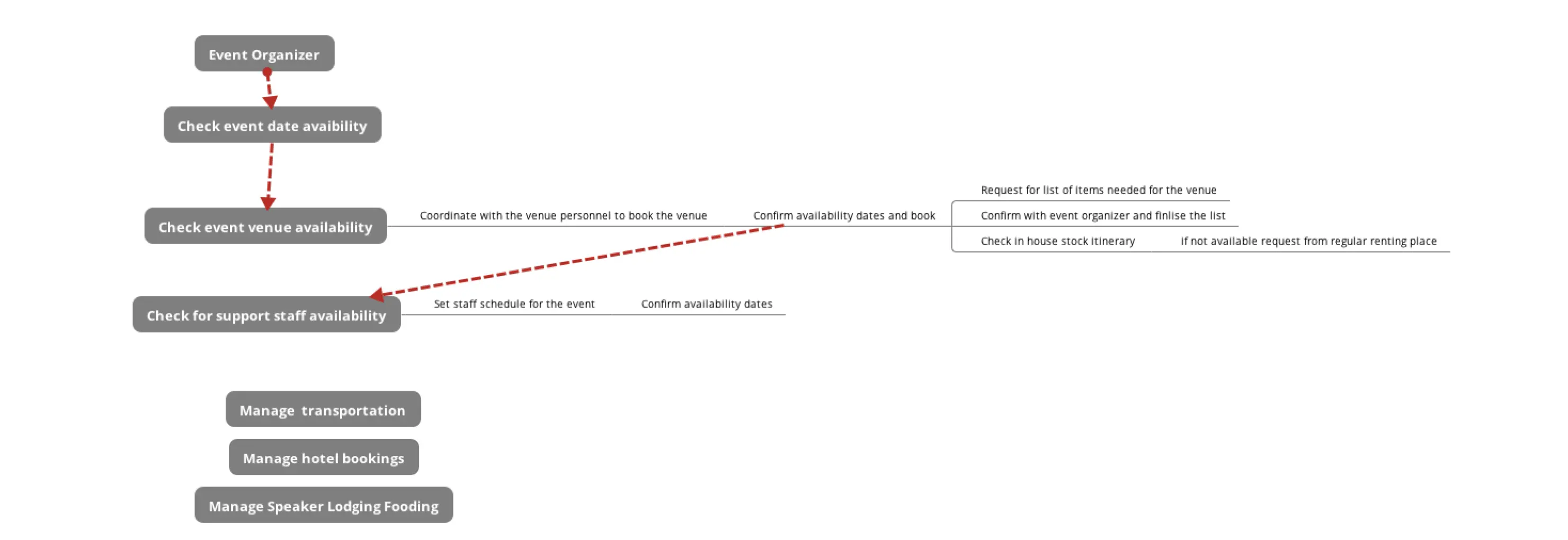
Simplifying the Multi-leveled Navigation
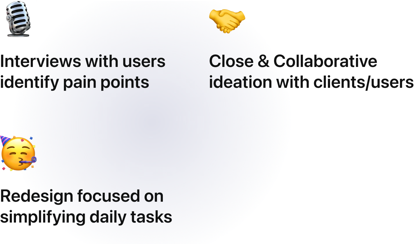
Through extensive semi-structured interviews with users and stakeholders, detailed software analysis, and ground research, I spearheaded a redesign for TraQ-IT, focusing on simplifying navigation and user interactions.
The existing user flows were cluttered and inefficient, requiring users to navigate across multiple screens to complete essential tasks–like adding an inventory, or updating a tiny information on the event. By streamlining these flows and eliminating unnecessary steps, I created a more intuitive experience that significantly reduced the time required for daily data input and improved overall usability. This effort not only revitalized TraQ-IT but also optimized the way users engaged with the platform.
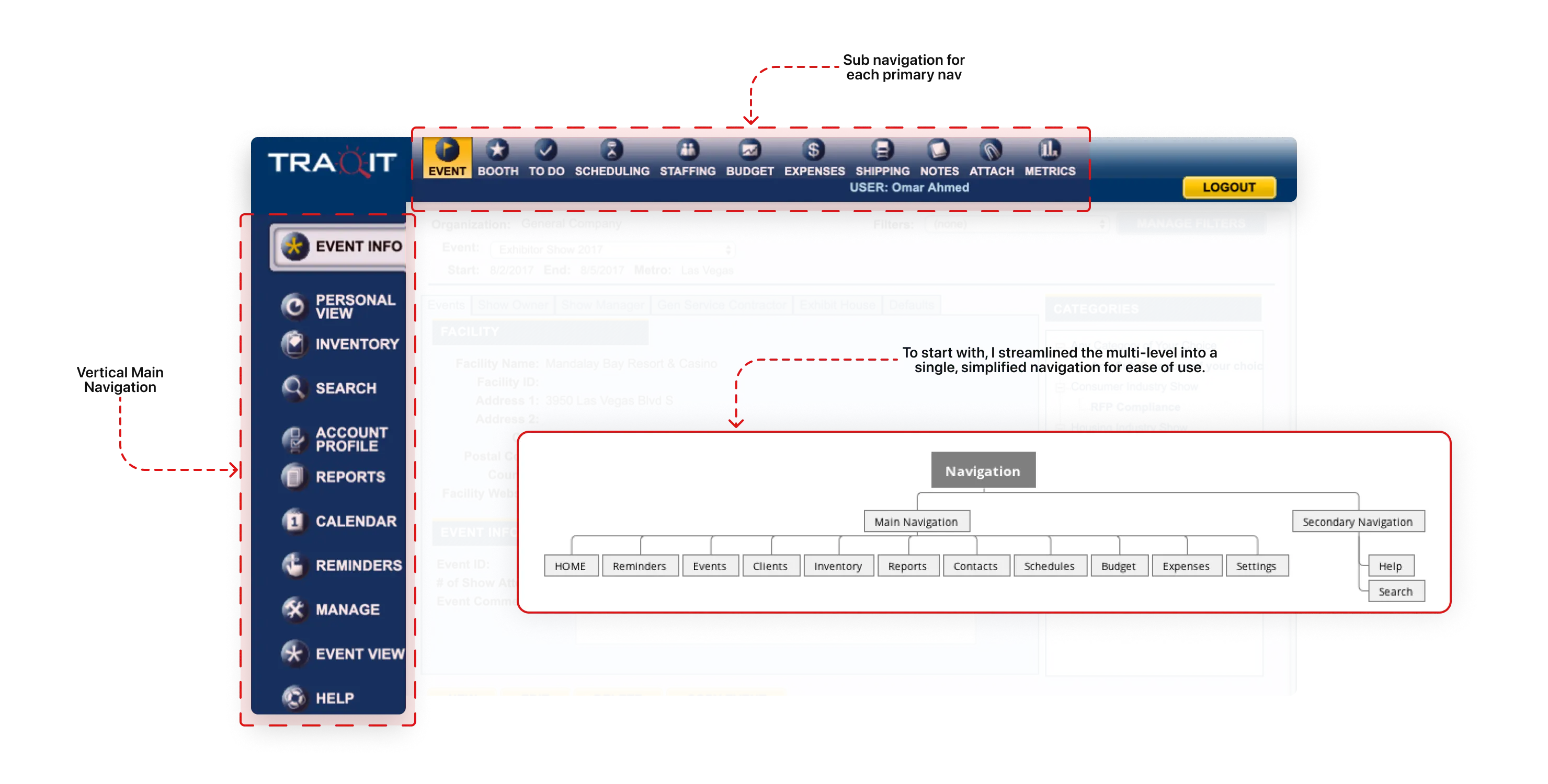
Shorten User Flows
Revising the user flows was a top priority during the TraQ-IT revamp, as it directly influenced the application's usability and overall user experience. Previously, users often had to navigate across multiple sections to complete essential tasks, leading to frustration and inefficiency. My initial analysis of the existing user flows uncovered several pain points and opportunities for improvement, paving the way for a more streamlined and intuitive approach.
I reimagined the navigation by simplifying user flows and eliminating long, multi-stepped forms, making daily data entry tasks faster and more intuitive. By addressing these inefficiencies, I reduced the time users spent on repetitive actions, enabling them to focus on more critical tasks. The result was a significantly improved user experience that enhanced productivity and engagement across the platform.
Recognizing these flaws allowed me to identify opportunities to streamline processes, reduce user frustration, and improve task completion times. This involved reimagining the journey from the user's perspective, removing unnecessary steps, and simplifying complex processes to foster a more engaging and productive user experience.
Initial Idea: Introducing a task-based interface
We introduced a task-based interface, inspired by users' daily interactions where they completed tasks assigned by managers or self-set reminders. Regarding the visual design, I was heavily influenced by Basecamp as they followed a daily task workflow.
To ensure the design aligned closely with user needs and business goals, I collaborated extensively with stakeholders and engaged in multiple rounds of discussions with the client.
I also involved early-stage development teams, users, and clients to gather preliminary feedback on the wireframes, allowing us to refine and iterate on the design early in the process for a more impactful solution.
Early Testing:What’s up with myevent? – Users
During initial testing, we quickly discovered that users were seeking a clear and concise overview of the events they were working on. They expressed a strong preference for having all the essential details readily accessible in one place, enabling them to efficiently track and manage their tasks without needing to navigate through multiple sections or screens.
Progression initeration & testing
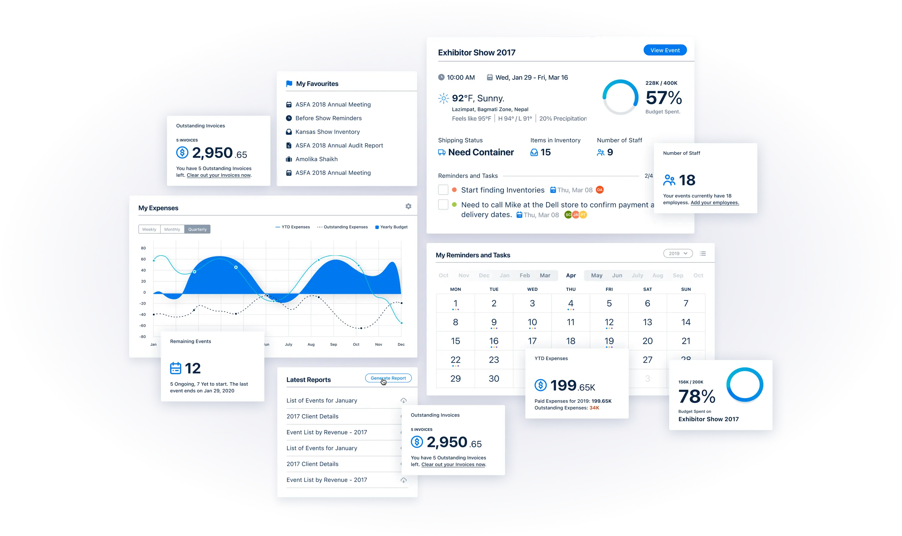
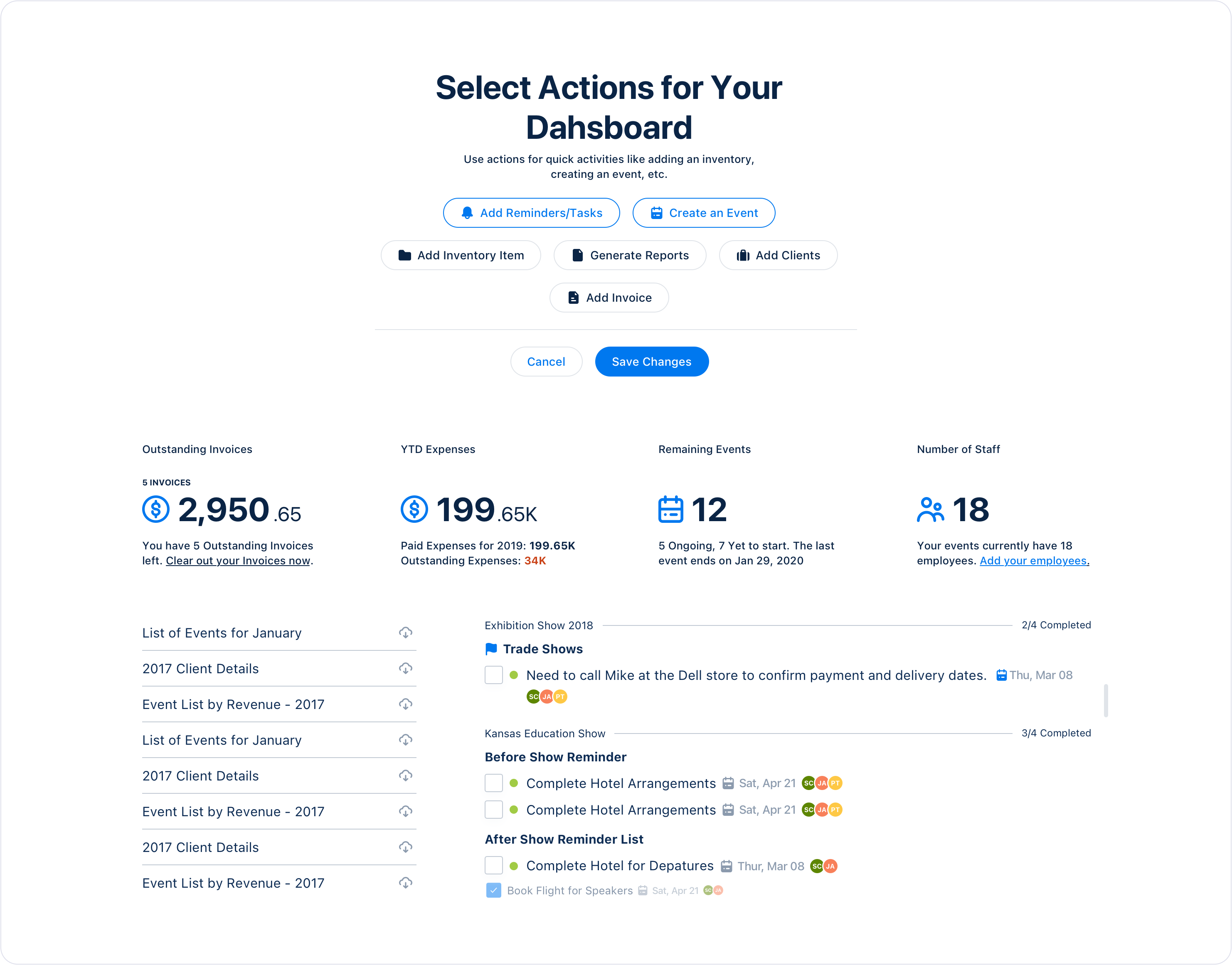
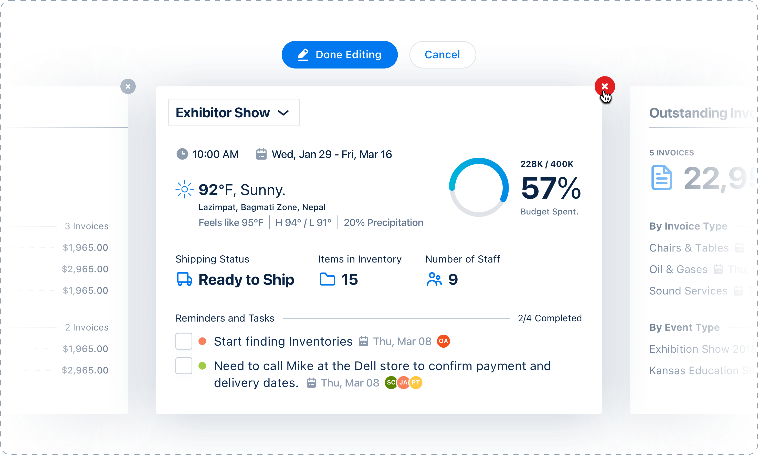
This led us to integrate KPIs directly into the dashboard, providing users with real-time insights.
We then conducted further testing to ensure the dashboard effectively met user needs.
Further Testing
I conducted multiple sets of one-on-one user tests using UserTesting.com and Zoom, observing users perform tasks within the application. This helped me improvise with my design each time I performed the design tests.
Stakeholders were a big-help in testing the design, and providing their thoughts on it.
Landing onthe final design
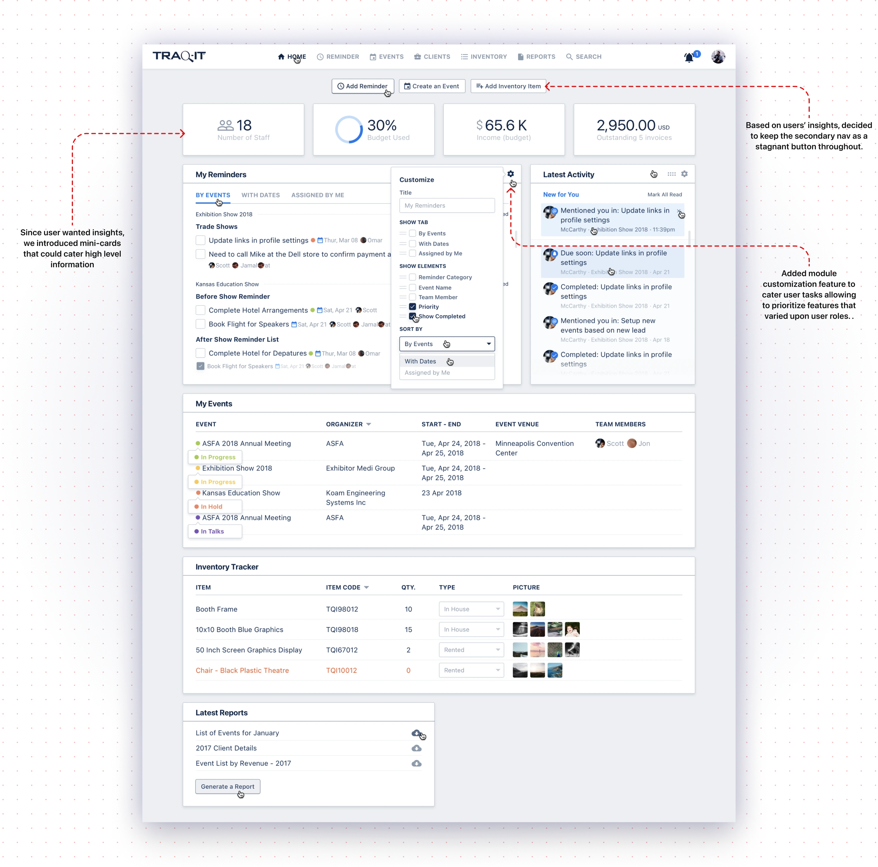
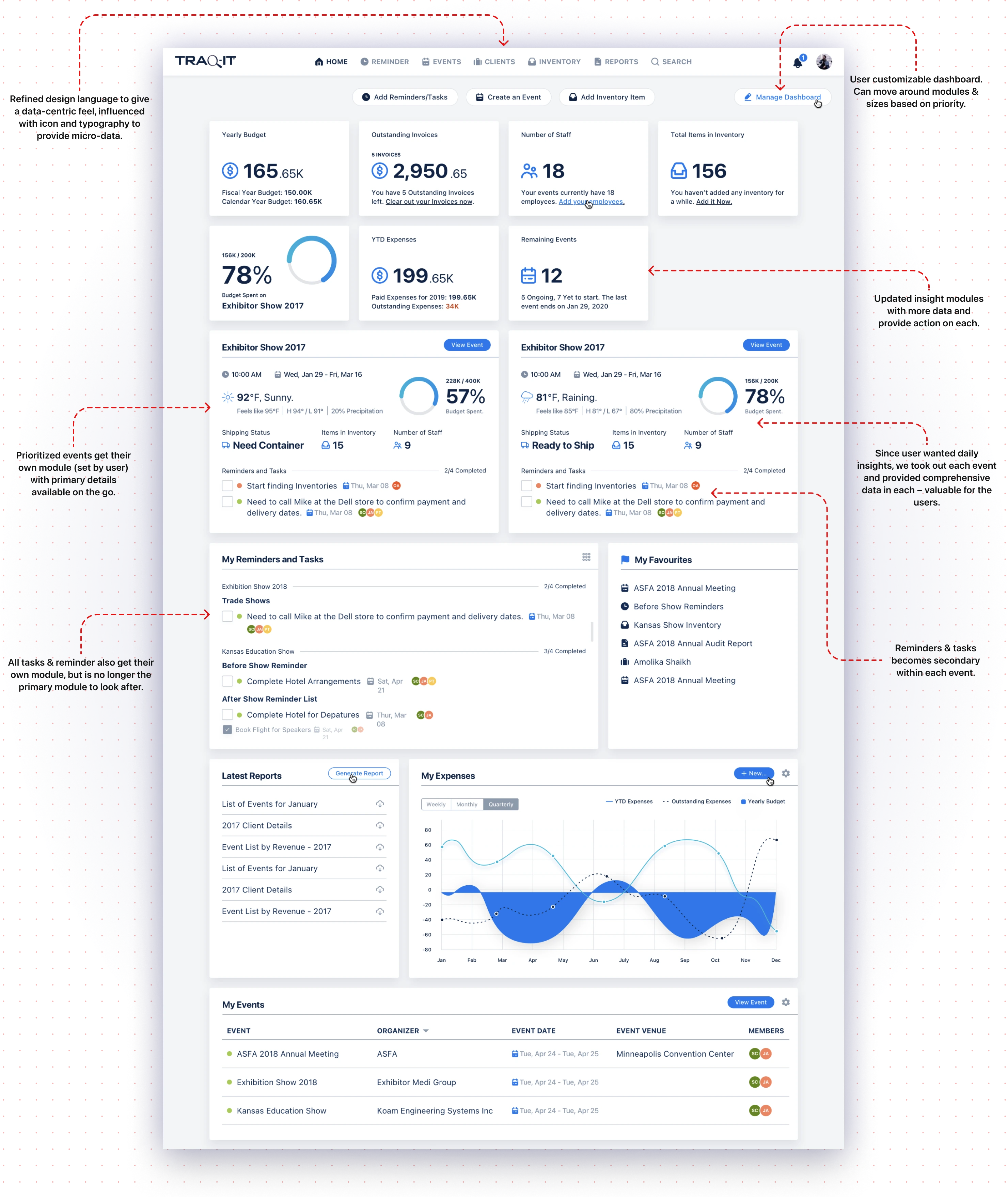
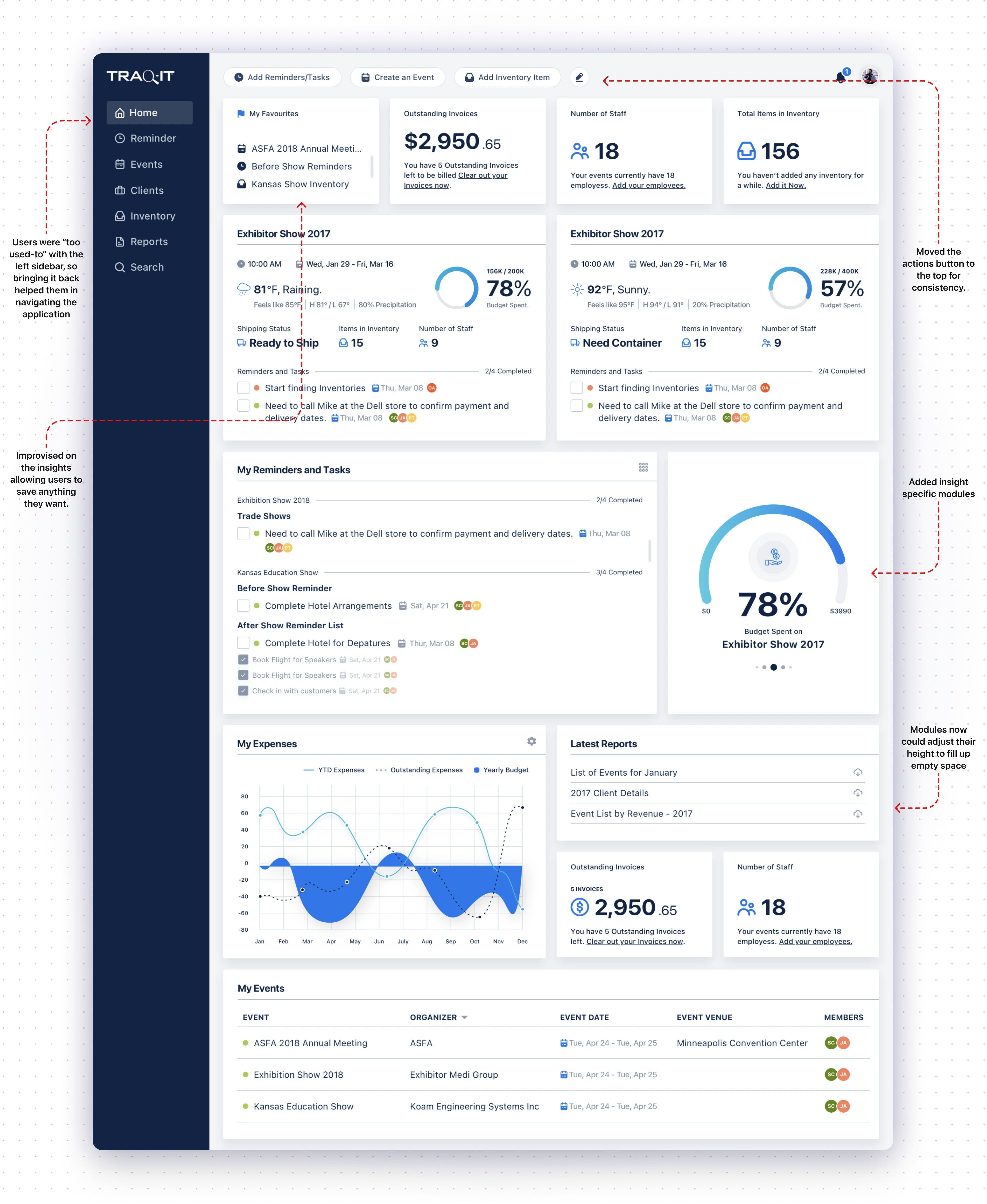
Recognizing users' preference for left navigation, we reintroduced it to enhance their comfort and ease of use.
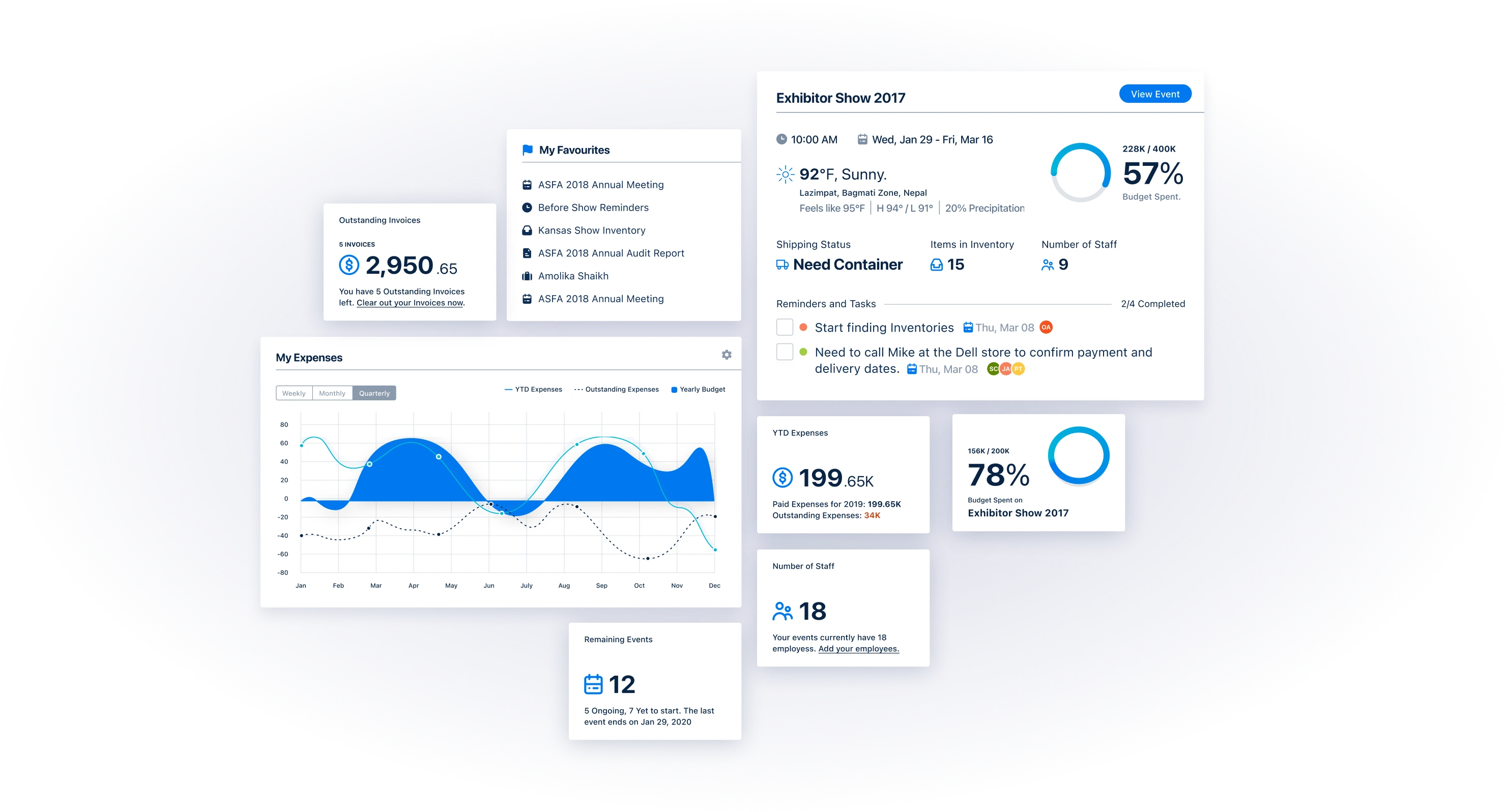
We created comprehensive "insight" cards tailored to each event, providing users with relevant data specific to their needs.
We introduced customization options, allowing users to create their own personalized dashboards.
Defining theInterface for the Revamp
I navigated the complexities of transitioning users from the familiar to the futuristic, balancing modern design principles with user familiarity, managing stakeholder inputs, and overcoming challenges such as limited budgets and extended development cycles. The case study highlights the impact of these changes on user efficiency and satisfaction, emphasizing the value of user experience in software evolution.
The development and refinement of Traqit's interface were guided by several foundational principles, each playing a crucial role in crafting a user experience that was intuitive, engaging, and accessible to a broad audience. Here's a closer look at these guiding principles:
ModularDesign Approach
Adopting a modular design approach was a strategic decision aimed at enhancing the scalability and maintainability of Traqit's interface. By breaking the UI into smaller, reusable components, I achieved high consistency across the application while streamlining the development process. This modularity facilitated rapid prototyping and iteration and simplified updates and extensions to the app's functionality. Designing each module with a clear purpose, from navigation to user input forms, allows for easy integration and reuse, streamlines the workflow, and supports a cohesive application architecture.
Accessibility Considerations
From the outset, I embedded accessibility into the design process, underscoring my commitment to inclusivity. Following web accessibility standards and guidelines, such as WCAG, was crucial in making Traqit accessible to users with disabilities. This included implementing features like high-contrast color schemes for users with visual impairments and ensuring keyboard navigability for those who cannot use a mouse. Prioritizing accessibility meant striving to remove barriers to access, ensuring Traqit was usable and beneficial for the broadest possible audience.
Interactive Elements
The design of interactive elements was approached with the user's experience at the forefront. I focused on making buttons, sliders, toggles, and other visually distinct and user-friendly components. Feedback mechanisms, such as animations following user actions, reassured users that their inputs were recognized. My attention to the design and feedback of interactive elements was critical in making the software usable and engaging, encouraging users to interact confidently.
Iterations & Testing
With each iteration, I refined the interface based on feedback from users, discussions with stakeholders, and my own evolving understanding of the best user experience practices. This cycle of design, test, gather feedback, and refine was repeated multiple times, allowing me to progressively enhance the usability and aesthetic appeal of the app. Iteration was more than just a method; it was a mindset that embraced flexibility and continuous improvement. It enabled me to adapt to unexpected challenges and incorporate new insights, ensuring that the final product truly met the needs and expectations of its users. This iterative process was fundamental in transforming Traqit into an application that was not only functional but also a pleasure to use, reflecting a deep commitment to excellence in design and user experience.
Highlights & Impact
The design process, client interactions, and teamwork have all contributed to my professional growth.
We achieved a notable efficiency boost, with users spending 38% less time on task creation and event management.
The landing page's conversion rate impressively hit 34% for new users, validating our design strategies.
Feedback highlighted the redesigned KPIs' effectiveness, making data retrieval straightforward and reducing the need for extensive navigation.
The positive user response to the software's features and its simplistic redesign affirmed the value of our user-centric approach.
Conclusion
Successes and Learnings
- The design process, client interactions, and teamwork have all contributed to my professional growth.
- We achieved a notable efficiency boost, with users spending 38% less time on task creation and event management.
- The landing page's conversion rate impressively hit 34% for new users, validating our design strategies.
- Feedback highlighted the redesigned KPIs' effectiveness, making data retrieval straightforward and reducing the need for extensive navigation.
- The positive user response to the software's features and its simplistic redesign affirmed the value of our user-centric approach.
Challenges and Areas for Improvement
- Budget constraints led to the omission of several planned steps, affecting the project's scope and potential.
- Increased stakeholder involvement in later design stages sometimes hindered creative freedom and decision-making.
- The extended project development cycle complicated the transition from phase 2 to phase 3, highlighting a need for greater agility and efficiency in our processes.
- In summary, the project was a blend of achievements and valuable lessons. The successes have been rewarding, while the challenges have provided clear directions for improvement. Moving forward, I aim to leverage these insights to enhance agility, creativity, and stakeholder collaboration in future projects.
Fintech App, Simplifi